Mai Lighthouse

Project Overview

For more than forty years, Franklin Family Support Services (FFSS) has been a cornerstone for families and individuals throughout the Franklin region. Over time, the organisation realised that its name no longer reflected the full range of services it provided. The existing identity felt outdated and failed to capture the inclusive and wide-reaching support it had grown to offer, making it more difficult to engage with the people it sought to help.

To address this, FFSS began a journey to create a new name and identity that would reflect its future focus and strengthen its bond with the community. The result was Mai Lighthouse, a name that symbolises guidance, safety, and empowerment, standing as a beacon of support for everyone in the region.

Research and Strategy

We began by grounding the renaming project in research. A detailed discovery phase helped uncover the organisation’s challenges, ambitions, and opportunities for growth. Through workshops with leaders, staff, and volunteers, we gained insights into how the brand was perceived and what direction it needed to take. Conversations with the wider community revealed that the organisation’s purpose and services were not always clearly understood, while sector analysis highlighted opportunities for clearer differentiation.

The research showed that although FFSS had built strong trust over four decades, its name and identity no longer reflected the full scope of its support. Many still associated it mainly with family services, overlooking its wider work with individuals, whānau, and the community. This confirmed the need for a new name that was more inclusive, future-focused, and representative of the organisation’s role as a guiding force.

Naming

The choice of the name Mai Lighthouse reflects both the vision and the values of the organisation. Mai, a word from te reo Māori, carries meanings of movement, direction, and connection. It suggests the idea of coming forward or moving towards something, echoing the organisation’s commitment to guiding people along their journey to stability and empowerment. Lighthouse brings with it connotations of safety, hope, and direction, embodying the organisation’s role as a steady presence helping families and individuals through difficult times.

By replacing a name that felt limited and institutional with one that is welcoming, inclusive, and purpose-driven, the organisation can now express its impact with greater clarity and connect with a broader community.

Creative Phase

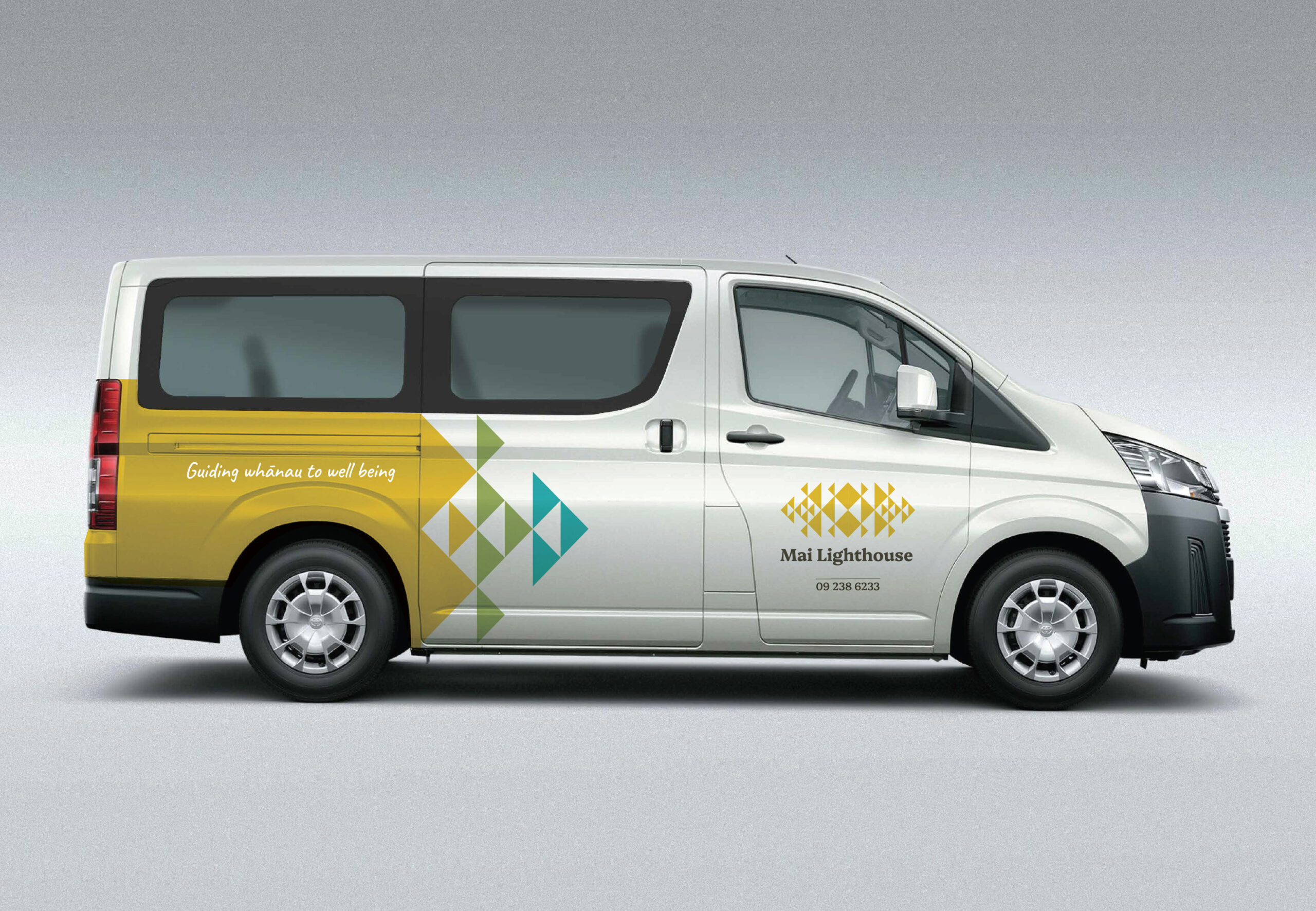
With the new name established, the focus turned to developing a visual identity that would embody the organisation’s mission while remaining deeply connected to local culture. Inspiration was drawn from the Manukau Lighthouse, a landmark recognised throughout the region as a symbol of guidance, resilience, and protection. Its presence provided a powerful metaphor for the organisation’s role as a steady source of direction and support.

To strengthen cultural authenticity and foster a sense of belonging, Māori design elements were woven into the creative expression. These motifs capture the essence of light as a beacon of hope, radiating the organisation’s reach and impact. They also emphasise the importance of whānau and collective strength, reflecting the idea of a wraparound support system. At the same time, the designs balance stability with movement, representing both the solid foundations the organisation provides and the progress it helps people achieve as they navigate life’s challenges.

The resulting identity is warm, approachable, and contemporary. Its colour palette draws from the surrounding landscape, grounding the brand in place while evoking safety, trust, and a strong sense of community.

Messaging

A strong brand identity depends on a clear and consistent messaging framework. For Mai Lighthouse, this framework was built around themes that reflect both its mission and the people it serves. At its heart is the idea of guidance and empowerment, positioning the organisation as a source of clarity and support for those navigating life’s challenges.

Equally important is the emphasis on inclusivity and community, expressing the organisation’s commitment to supporting individuals, whānau, and groups from all walks of life. Alongside this sits the message of stability and trust, conveying warmth, dependability, and the assurance that Mai Lighthouse is a safe place to turn when support is needed. Finally, the identity communicates growth and transformation, capturing how the organisation helps people move forward, regain control, and create positive change in their lives.

Together, these elements provide a consistent voice for the brand, ensuring every message delivered by Mai Lighthouse feels authentic, purposeful, and aligned with its values.

The resulting identity is warm, approachable, and contemporary. Its colour palette draws from the surrounding landscape, grounding the brand in place while evoking safety, trust, and a strong sense of community.

Conclusion

The shift to Mai Lighthouse has given the organisation a more confident and recognisable identity. The new name captures the full scope of services on offer, strengthening its ability to reach those in need while affirming its place as a dependable presence within the community.

Since its introduction, the reaction has been resoundingly positive, not only from staff and stakeholders but also from the people who benefit most from its support. With a brand that now reflects its true vision and purpose, Mai Lighthouse is well equipped to expand its reach and ensure that no one is left to face life’s challenges without guidance and support.


Log in with your credentials

Forgot your details?