Capire

Capire - Collateral design

Background

Helen approached us seeking greater clarity and direction in how she presented herself. Highly skilled, experienced, and trusted by her clients, she had built a strong reputation, yet her professional image hadn’t fully caught up with the standard of her work. She wanted her brand to reflect the calibre and credibility she was already known for.

One of the key challenges lay in articulating the full scope of her work. With expertise spanning such a wide field, she needed a way to convey this.

What she needed was a brand that captured her story with accuracy and pride, one that could stand alongside the exceptional results she delivers for her clients.

Evidence gathering

We began with an in-depth workshop to understand Helen’s business, strategy, and goals, followed by a review of competitors in her field. To complement this, we carried out detailed interviews with a selection of her clients, uncovering not only how they perceived her services but also what they most valued and the language they naturally used to describe her work.

These insights shaped a core proposition: Complexity Simplified—the promise of clarity.

From there, we explored a wide range of potential names across different themes, refining and testing until one stood out. After much consideration, we chose the name that best encapsulates her value: Capire.

The Naming Process

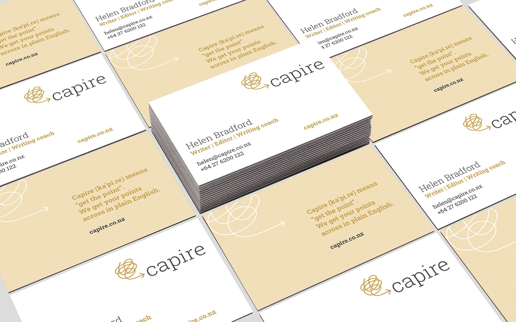
Capire (ka’pi.re) translates as “get the point.” Helen’s expertise lies in helping her clients express their message in clear, plain English—while preserving the authority, mana, and impact of their words.

Outcome

Creative

The approach guided the creative brief and provided the team with a clear theme to build the brand around. To capture the sense of confusion clients often face, we used soft illustrations that quickly communicated her unique value, mirroring the clarity she strives to bring to her clients’ documents.

The combination of these illustrations with a gentle colour palette distinguishes Capire from the typical ‘writer/editor’ space and has proven to resonate strongly with audiences.

Here’s a complete rewording with a smoother, more polished flow:


The Brand Symbol

The symbol begins as a tangled, looping line that twists in a jumble before resolving into a clear arrow, directed toward the word Capire, meaning “to understand” or “get the point.”

This shape represents the mind at work, with ideas swirling until they take form and are expressed with clarity. It captures the essence of the copywriting process: turning complexity into communication. The same line style extends into the supporting service illustrations, evoking the act of jotting down thoughts and shaping them into solutions. Together, it conveys the abstract yet deeply human nature of copywriting and editing.


Log in with your credentials

Forgot your details?